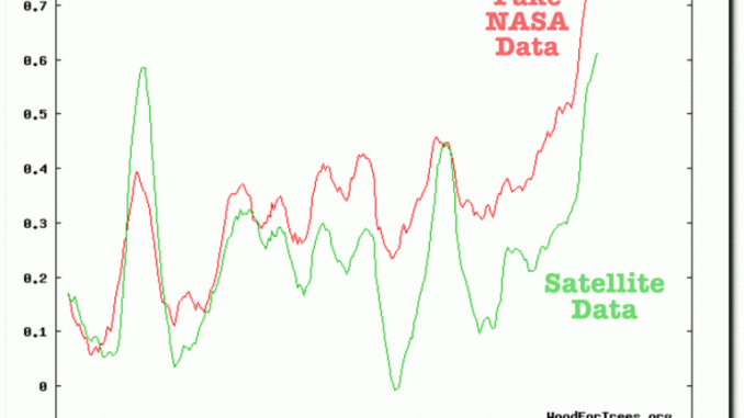
Image: Load of bollocks: 2016 allegedly ‘hottest year’ by unmeasureable 1/100 of a degree – While satellites show ‘pause’ continues
Reports, such as one indicating 2016 to be the hottest year on record, draw on the temperature anomalies from a data set maintained by the Goddard Institute for Space Studies Surface Temperature Analysis (GISTEMP). GISTEMP is “an estimate of global surface temperature change…using current data files from NOAA (National Oceanic and Atmospheric Administration).” The entire 137-year monthly data set, from 1880 through June 2017, in degrees Celsius anomalies (deviations from the corresponding 1951-1980 means), as updated monthly, is located in both spreadsheet and text forms.
From that data, I have generated the following chart of recent year data, particularly centered around that supposed “hottest year on record”, namely 2016.
Most obvious in the chart, is that calendar year comparisons can be deceptive. Specifically, the year 2016 (red) was NOT the hottest year on record because every month was a record, but because the first four or five months wereabnormally hot, a trend that actually began the last three months of 2015 (yellow). The first nine months of 2015 would characterize that year as moderate, at least in terms of recent years.
After record heat in the first quarter of 2016, something interesting began occurring, not reported in the press. Temperatures trended downwards sharply in the months of April, May and June of 2016. And most importantly the sharp downward trend contradicted the more typical tendency (at least for 2013, 2014, and 2015) to show no particular trend. The last six months on 2016 showed some above-average warming, but of a seasonal nature.
The current year began with temperature anomalies at levels between the record 2016 and the more “normal” 2015 levels, before again trending downward sharply in a counter-seasonal fashion, in the second quarter. The rest of 2017 appears likely to end up in the same dense cluster of temperatures of other recent years.
My conclusion, as a professional statistician with decades of experience analyzing time series data (not of temperatures but of economic phenomenon), is that a sharp aberration in (near term) temperatures occurred over a six-month period extending from October 2015 through March 2016. That period appears well behind us, as temperature anomalies return towards more normal levels, at least for recent years.


