

Fake temperature data from NASA is used in this graph (same for all the graphs in this story), and still it runs too hot. The “green” Nazi left is bad at EVERYTHING, even at cheating ???
Story from Climate etc.
Millar et al. attracted controversy for stating that climate models have shown too much warming in recent decades, even though others (including the IPCC) have said the same thing. The model-observational discrepancy is real, and needs to be taken into account especially when using models for policy guidance.
A number of authors, including the IPCC, have argued that climate models have systematically overstated the rate of global warming in recent decades. A recent paper by Millar et al. (2017) presented the same finding in a diagram of temperature change versus cumulative carbon emissions since 1870.
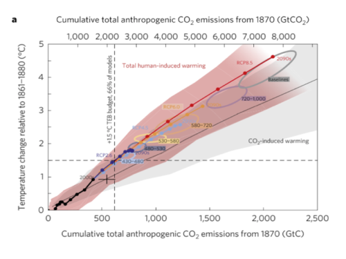
The horizontal axis is correlated with time but by using cumulative CO2 instead the authors infer a policy conclusion. The line with circles along it represents the CMIP5 ensemble mean path outlined by climate models. The vertical dashed line represents a carbon level where two thirds of the climate models say that much extra CO2 in the air translates into at least 1.5 oC warming. The black cross shows the estimated historical cumulative total CO2 emissions and the estimated observed warming. Notably it lies below the model line. The models show more warming than observed at lower emissions than have occurred. The vertical distance from the cross to the model line indicates that once the models have caught up with observed emissions they will have projected 0.3 oC more warming than has been seen, and will be very close (only seven years away) to the 1.5 oC level, which they associate with 615 GtC. With historical CO2 emissions adding up to 545 GtC that means we can only emit another 70 GtC, the so-called “carbon budget.”
Extrapolating forward based on the observed warming rate suggests that the 1.5 oC level would not be reached until cumulative emissions are more than 200 GtC above the current level, and possibly much higher. The gist of the article, therefore, is that because observations do not show the rapid warming shown in the models, this means there is more time to meet policy goals.
As an aside, I dislike the “carbon budget” language because it implies the existence of an arbitrary hard cap on allowable emissions, which rarely emerges as an optimal solution in models of environmental policy, and never in mainstream analyses of the climate issue except under some extreme assumptions about the nature of damages. But that’s a subject for another occasion.
Were Millar et al. authors right to assert that climate models have overstated recent warming? They are certainly not the first to make this claim. Fyfe et al. (2013) compared Hadley Centre temperature series (HadCRUT4) temperatures to the CMIP5 ensemble and showed that most models had higher trends over the 1998-2012 interval than were observed:

Original caption: a, 1993–2012. b, 1998–2012. Histograms of observed trends (red hatching) are from 100 reconstructions of the HadCRUT4 dataset1. Histograms of model trends (grey bars) are based on 117 simulations of the models, and black curves are smoothed versions of the model trends. The ranges of observed trends reflect observational uncertainty, whereas the ranges of model trends reflect forcing uncertainty, as well as differences in individual model responses to external forcings and uncertainty arising from internal climate variability.
The IPCC’s Fifth Assessment Report also acknowledged model over-estimation of recent warming in their Figure 9.8 and accompanying discussion in Box 9.2. I have updated the IPCC chart as follows. I set the CMIP5 range to gray, and the thin white lines show the (year-by-year) central 66% and 95% of model projections. The chart uses the most recent version of the HadCRUT4 data, which goes to the end of 2016. All data are centered on 1961-1990.
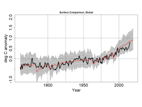
Even with the 2016 EL-Nino event, the HadCRUT4 series does not reach the mean of the CMIP5 ensemble. Prior to 2000 the longest interval without a crossing between the red and black lines was 12 years, but the current one now runs to 18 years.
This would appear to confirm the claim in Millar et al. that climate models display an exaggerated recent warming rate not observed in the data.
Ref.: https://www.thegwpf.com/ross-mckitrick-despite-denial-climate-models-are-running-too-hot/
……………………..
Peter Temple Explains Solar Cycles, Grand Minimums And The Collapse Of Man – History Repeats Itself
The bottom line is that climate is cyclical … like just about anything else in the Universe. Cycles are in everything. In fact, I challenge anyone to find a straight line that exists naturally (they seem to come from the minds of economists, as far as I can make out).
My attempts to simplify the explanation, however, can gloss over the actual complexity of all the forces at work.
