

By Edwin Berry
BUSTED: Intergovernmental Panel on Climate Change (IPCC) simply assumes nature treats human-produced and nature-produced carbon dioxide differently. This assumption is wrong because it violates the Equivalence Principle.
IPCC’s basic assumption infects climate models. IPCC’s Bern model, a 7-parameter curvefit to climate model output, predicts human carbon dioxide stays in the atmosphere for a long time, some of it forever. That conclusion is a result of IPCC’s basic assumption and it is wrong.
Applying the Equivalence Principle, the Bern model predicts natural emissions will cause a runaway carbon dioxide level that contradicts data. Therefore, IPCC climate models are wrong.
IPCC’s model cannot simulate the carbon-14 data.
A Model, derived from the continuity equation with outflow proportional to level, accurately simulates the carbon-14 data with no arbitrary curve-fitting parameters.

The Model shows constant carbon dioxide emissions, human or natural, do not add more carbon dioxide to the atmosphere. Rather their inflows set equilibrium levels for atmospheric carbon dioxide.
Using IPCC data, the Model shows present human emissions increase the level by 18 ppm and present natural emissions increase the level by 392 ppm to produce today’s total level of 410 ppm.
Any climate change caused by increased CO2 is 96 percent from natural CO2 and only 4 percent from human CO2. The effect of human emissions is the same as if natural emissions had increased by the same amount and human emissions had remained zero.
The critical scientific questions about climate change are about cause-and-effect:
1. How much do human emissions increase atmospheric carbon dioxide?
2. How much does increased atmospheric carbon dioxide change climate?
This paper focuses on the first question.
Full paper available at: edberry.com/blog
Conclusions
• PCC’s basic assumption, that nature treats human carbon dioxide emissions differently than it treats nature’s carbon dioxide emissions, is wrong because it violates the Equivalence Principle.
• IPCC’s claim, that human carbon dioxide emissions will linger in the atmosphere for hundreds of years and 15 percent will remain forever, is invalid.
• IPCC’s claim that human emissions have caused all the rise in the level of carbon dioxide in the atmosphere since 1750, is invalid.
• The Model has no arbitrary curve-fit parameters. Yet, it accurately simulates the carbon-14 data.
• The Model shows human emissions add only 18 ppm and nature adds 392 ppm to produce today’s 410 ppm level of carbon dioxide.
• If all human CO2 emissions were stopped, the level of carbon dioxide in our atmosphere would fall by only 18 ppm.
• The effect of human emissions is the same as if natural emissions had increased by the same amount and human emissions had remained zero.
Ref.: https://wattsupwiththat.com/2018/09/13/heat-analysis-of-noaa-data-suggests-the-us-is-not-seeing-increased-warming/
Related
The Embarrassing Bomb-Test-Curve

Why all the fuss about carbon? It only stays in the atmosphere for 10 years.
During the 1950s and 1960s, several nations performed atmospheric tests of nuclear weapons. The radiation effects of these tests produced large amounts of C14-carbon dioxide (14CO2) in the air. 14C is an isotope of carbon, the common isotope being 12C. When the bomb tests ceased in 1963, the atmospheric level of 14CO2 had been raised to about twice its previous natural value. This extra 14CO2 can be used as a tracer for tracking the movement of carbon through the natural world – the Carbon Cycle. This wonderfully serendipitous experiment would be hard to beat even if someone designed it.
Over the following half-century the amount of 14CO2 measured in the global atmosphere diminished in a text-book exponential manner as shown in the diagrams above.
14C is radioactive but this curve is not the radioactive decay curve. The half-life of radioactive 14C is 5,730 years , whereas the half-time of the bomb-test curve is only 10 years, i.e. after 10 years only half was left, after 20 years, one quarter was left, after 30 years, only one eighth and so on.
The half-time of CO2 in the atmosphere is of great interest to climate modellers. They assume that CO2 is removed from the atmosphere according to a theoretical curve called the “Bern Model” or a similar curve called the ISAM model. The blue line in the lower panel shows predicted atmospheric decay curve of 14CO2according to the Bern Model. It is quite different to the observed curve.
The Bern Model utilises four different half-times and does not return to nearly zero after 60 years as does the bomb-test curve. According to the Bern Model it will take centuries for 14CO2 (and anthropogenic CO2) to be ultimately removed from the atmosphere. The modellers chose to adopt the more alarmist scenario despite the fact that it is “non-physical” (i.e. obviously wrong).
Admittedly it is complicated: CO2 reacts with water chemically and this slows down the rate at which it dissolves. Furthermore, while there is a fast interchange of gases between the atmosphere and the top 100 metres or so of the ocean called the “mixed layer” (~70 Gt per year), it is widely assumed that there is much less transport through the bottom of the mixed layer (~2 Gt per year, IPCC figures). The latter is the reason for the flattening out of the Bern Model curve at times longer than 60 years.
But despite these quibbles about the half-time and the shape of the curve, one incontrovertible fact remains:
In 50 years nearly all the bomb-test 14CO2 has disappeared!
Since the 14CO2 reaction rates, solubilities and diffusion times are very similar to those 12CO2, this implies that all the ordinary atmospheric CO2 in the atmosphere at the time of the bomb test has completely changed over.
Where has all the 14CO2 gone?
There are various possible CO2 reservoirs, e.g. the biosphere and the mixed layer, but the problem is that these are roughly same size as the atmosphere. A new equilibrium would be soon be reached wherein the bomb 14CO2 would be partitioned between the reservoirs in proportion to their capacity, so causing the bomb 14CO2 in the atmosphere to level off in a similar way to the Bern model curve.
Instead it tends to zero. That this happens implies that the bomb 14CO2 has either been transported to a reservoir that is much, much larger than the atmosphere or it has left the ocean-atmosphere system.
It is commonly accepted that approximately 38,000 Gt of CO2 are dissolved in the deep ocean, more than 100 times the amount generated by humans since the start of the industrial revolution. The deep ocean is larger than any other conceivable reservoir. Either the missing 14C is sequestered in the deep ocean or it has been removed altogether, perhaps as carbonate in the skeletal material of sea creatures.
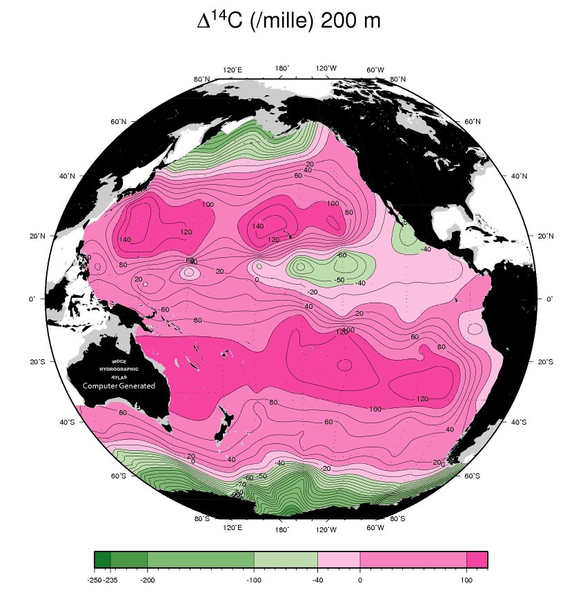
WOCE – the World Ocean Circulation Experiment produced detailed maps of the major constituents of the oceans in the mid-1990s. The WOCE Atlas is on-line and it is certainly worth a look; oceanography at its very best. The Pacific Ocean maps and sections are the most detailed and complete.
One of the chemical signatures mapped by WOCE is delta 14C, the proportion of 14C above the background level. Here is a map of delta 14C in the Pacific Ocean at a depth of 200 metres:
And here is a longitudinal section of the top 1000m at 150 deg W (near the Hawaiian Islands, represented by the black bar):

All of the pink area (delta 14C positive) reflects bomb-test 14C. Using WOCE maps of total carbon it is possible to estimate how much of the bomb-contaminated atmosphere finished up in the Pacific Ocean after 30 years.
The answer is 30 Gt, only a tiny fraction of 700 Gt lost from the atmosphere in that time.
Evidently atmospheric carbon is being sequestered in the Pacific at the rate of about 1 Gt/year which fits the IPCC figure of 2Gt per year for the whole ocean. Wherever most of the bomb-test 14C has gone, it is not the Pacific Ocean.
What about the Southern Ocean? Because the Southern Ocean is so turbulent, it has a very deep mixed layer and, in theory, this should allow, atmospheric CO2 to mix down much deeper and then to flow northward along constant density surfaces (isopycnals) into the deep, temperate-zone ocean. However recent theoretical work (Sallee et al, Nature Geoscience, 2012) has shown that only 0.42 Gt per year can be sequestered in this way. Furthermore WOCE sections such as Section P16, shown above, do not support the idea that the Southern Ocean is the gateway for CO2 transport into the deep Pacific. Rather, these observations imply that the bomb-test 14C has moved slowly downwards and equator-wards from the north and south temperate zone mixed layers across the isopycnals.
What about the Indian and Atlantic Oceans?There appears to be no WOCE delta 14C data available for these oceans. After 20 years the WOCE people have not quite gotten around to working up the Indian and Atlantic 14C data for public display.
What is the problem? Bomb-test 14C is the best tracer available for tracking the circulation of the deep ocean, the stated aim of the World Ocean Circulation Experiment. Its absence from the WOCE data sets is very strange. Under normal circumstances it would be reasonable to assume that this is due to some sort of technical glitch or funding hiatus. However taken together with NASA’s obvious embarrassment with their remarkable OCO-2 satellite observations of atmospheric CO2 distribution discussed previously here and here, it implies a hidden agenda. At the time of writing no further OCO-2 maps have been published by NASA. Why are CO2 maps so embarrassing?
The Keeling Curve. Wikipedia: The Keeling Curve is a graph which plots the ongoing change in concentration of carbon dioxide in Earth’s atmosphere since 1958. It is based on continuous measurements taken at the Mauna Loa Observatory in Hawaii that began under the supervision of Charles David Keeling. Keeling’s measurements showed the first significant evidence of rapidly increasing carbon dioxide levels in the atmosphere. Many scientists credit Keeling’s graph with first bringing the world’s attention to the current increase of carbon dioxide in the atmosphere.
Graphs showing the remorseless increase of atmospheric CO2 are commonplace on the Web and in the media. Keeling’s Mauna Loa graph has been replicated many times at other monitoring sites throughout the world such as the Baseline Monitoring Station at Cape Grim in NW Tasmania. It is incontestable; the concentration of CO2 in the atmosphere has been steadily increasing since 1958.
What is contestable is the explanation given for this increase. It is commonly assumed that the increase is entirely due to human industrial activity and land-use changes. It is commonly assumed that the movement of CO2 through the oceans and the biosphere, the Carbon Cycle, is well understood and that the human contribution is both significant and harmful. The bomb-test curve shows these assumptions to be questionable. It shows that the Carbon Cycle is certainly not well understood and that atmospheric CO2 does not behave as we thought it did back in 1995 when the IPCC was set up. As more information comes to light, the assumptions on which “Climate Science” is based become ever more dubious.
Gösta Pettersson, Professor Emeritus of biochemistry at Lund University and an expert in reaction kinetics, estimates that less than half of the observed CO2 increase is man-made. Murry Salby suggests the figure is less than one-third. If half of the atmospheric CO2 (360 Gt) turns over every 10 years due to natural causes this is hardly surprising; the human contribution in ten years is around 90 Gt.
Pettersson has self-published a book on this, “Falkst Alarm”, which unfortunately is in Swedish. English versions of key chapters can be downloaded here (paper4 and paper5). A more formal description of the above argument can be found here: BombTestImplications
Climate change has become a billion dollar industry. Let’s not spoil a good thing for the sake of a single graph.
