

The National Oceanic and Atmospheric Administration (NOAA) has yet again been caught exaggerating ‘global warming’ by fiddling with the raw temperature data.
This time, that data concerns the recent record-breaking cold across the northeastern U.S. which NOAA is trying to erase from history.
If you believe NOAA’s charts, there was nothing particularly unusual about this winter’s cold weather which caused sharks to freeze in the ocean and iguanas to drop out of trees.
Here is NOAA’s January 2018 chart for Northeast U.S. – an area which includes New England along with NY, PA, NJ, DE and MD.
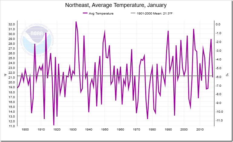
You’d never guess from it that those regions had just experienced record-breaking cold, would you?
That’s because, as Paul Homewood has discovered, NOAA has been cooking the books. Yet again – presumably for reasons more to do with ideology than meteorology – NOAA has adjusted past temperatures to look colder than they were and recent temperatures to look warmer than they were.
We’re not talking fractions of a degree, here. The adjustments amount to a whopping 3.1 degrees F. This takes us well beyond the regions of error margins or innocent mistakes and deep into the realm of fiction and political propaganda.
Homewood first smelt a rat when he examined the New York data sets.
He was particularly puzzled at NOAA’s treatment of the especially cold winter that ravaged New York in 2013/14, which he describes here:
The cold weather really began on Jan 2nd, when an Arctic front descended across much of the country, and extended well into March.
The NWS wrote at the end of the winter:
The winter of 2013-14 finished as one of the coldest winters in recent memory for New York State. Snowfall across Western and North Central New York was above normal for many areas, and in some locations well above normal. This winter comes on the heels of two previous mild winters, making the cold and snow this winter feel that much harsher.
Temperatures this winter finished below normal every month, and the January through March timeframe finished at least 4 degrees below normal for the two primary climate stations of Western New York (Buffalo and Rochester)…..
Relentless cold continued through the month of January across the region.
So why, he wondered, did NOAA have this marked down as only the 30th coldest winter (since 1895) on its New York State charts, with a mean temperature of 16.9F?
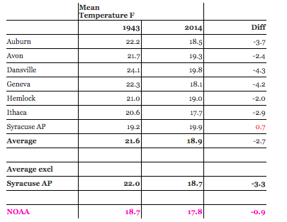
Homewood compared the local records for January 1943 and January 2014 – months which, according to NOAA’s charts, had very similar average temperatures.
What he found was that NOAA’s charts were deeply inaccurate. The 2014 local temperatures had been adjusted upwards by NOAA and the 1943 local temperatures downwards.
He concludes:
On average the mean temperatures in Jan 2014 were 2.7F less than in 1943. Yet, according to NOAA, the difference was only 0.9F.
Somehow, NOAA has adjusted past temperatures down, relatively, by 1.8F.
Now, Homewood has given the same treatment to the most recent Big Freeze – the winter of 2017/2018.
Yet again, he has found that NOAA’s arbitrary adjustments tell a lie. They claim that January 2018 was warmer in the New York region than January 1943, when the raw data from local stations tells us this just isn’t true.
So at the three sites of Ithaca, Auburn and Geneva, we find that January 2018 was colder than January 1943 by 1.0, 1.7 and 1.3F respectively.
Yet NOAA say that the division was 2.1F warmer last month. NOAA’s figure makes last month at least 3.1F warmer in comparison with 1943 than the actual station data warrants.
He concludes:
Clearly NOAA’s highly homogenised and adjusted version of the Central Lakes temperature record bears no resemblance at all the the actual station data.
And if this one division is so badly in error, what confidence can there be that the rest of the US is any better?
Well indeed. The key point here is that while NOAA frequently makes these adjustments to the raw data, it has never offered a convincing explanation as to why they are necessary. Nor yet, how exactly their adjusted data provides a more accurate version of the truth than the original data.
One excuse NOAA’s apologists make is that weather stations are subject to changing environmental conditions. For example, when the station sited at Syracuse in 1929 was located at what was originally just a sparse aerodrome. Since then, however, as Homewood notes, it has grown into a large international airport with two runways servicing two million passengers a year. Its weather station readings therefore will certainly have been corrupted by the Urban Heat Island effect: that is, its temperature readings will have been artificially elevated by the warmth from the surrounding development and aircraft engines.
So you’d think, wouldn’t you, that to compensate for this NOAA would adjust the recent temperatures downwards. Instead, for no obvious reasons, it has adjusted them upwards.
This is a scandal. NOAA’s climate gatekeepers are political activists not honest scientists and the U.S. taxpayer has no business funding their propaganda.
Drain the swamp!
Ref.: http://www.breitbart.com/big-government/2018/02/20/delingpole-noaa-caught-adjusting-big-freeze-out-of-existence/
…………………….
That’s why it’s called climate SWINDLE. It’s about money, not honest science .. Here’s another example:
Al Gore Cherry-Picks Data To Paint A Favorable Picture Of Paris Accord Progress
Al Gore chairman of Generation Investment Management gestures during the Web Summit, Europe’s biggest tech conference, in Lisbon, Portugal, November 9, 2017. REUTERS/Pedro Nunes
Former Vice President Al Gore is using recently reported green energy data to paint a rosy picture of the progress countries are making towards fulfilling their Paris climate accord commitments.
Gore cited data that wind turbines and solar panels made up more than half the electricity capacity additions in the U.S., China, Europe and India in 2017. Most of the world’s greenhouse gas emission growth is expected to come from India and China.
As clean renewable energy continues to grow at an unprecedented pace, the highest emitting countries are driving toward their #ParisAgreement commitments. In 2017, more than half of new electricity capacity in each of the top 4 carbon emitters came from #wind & #solar.
— Al Gore (@algore) February 20, 2018
While not untrue, Gore is obscuring the fact that China and India still get the vast majority of their energy from fossil fuels. Both countries also saw their emissions rise in 2017, despite the large percentage of new electricity additions that came from green energy sources.
Citing a Rhodium Group report, Gore said wind and solar made up 55 percent of China’s new electricity capacity additions. China is the world’s largest greenhouse gas emitter.
In China (28% of global emissions), wind + solar = 55% of new electricity capacity in 2017, according to @rhodium_group: https://t.co/DrdNHsFYak
— Al Gore (@algore) February 20, 2018
However, “clean energy” makes up around 10 percent of Chinese power consumption, but that includes nuclear and hydroelectric power. More than 60 percent of China’s electricity came from coal.
China’s communist government does seem to be taking some moves to clamp down on pollution, but the country is far from decarbonizing.
China also saw its emissions grow 3.5 percent in 2017, according to the Global Carbon Project. China’s emissions growth was largely responsible for a 2 percent rise in global emissions.
The Global Carbon Project does note the “2017 growth may result from economic stimulus from the Chinese government, and may not continue in the years ahead,” but “an actual decline in global emissions might still be beyond our immediate reach, especially given projections for stronger economic growth in 2018.”
It’s a similar story for India. Gore touted the fact that 64 percent of India’s new electricity capacity came from wind and solar.
In India (7% of global emissions), wind + solar = 64% of new electricity capacity in 2017, according to @Mercomindia: https://t.co/8j2fth3iqT
— Al Gore (@algore) February 20, 2018
But again, coal makes up 75 percent of India’s installed electricity capacity. India’s government says renewable energy sources, other than nuclear and hydro, make up around 13 percent of installed capacity.
India’s largest coal company also projects a 50 to 120 percent growth in coal consumption by 2030. Green energy additions would make the lower end more likely, but regardless, coal use is likely to grow a significant amount.
In the end, what Gore fails to point out is the world needs to reduce fossil fuel consumption 90 percent by 2050 to meet the goals of the Paris accord, based on UN estimates. University of Colorado professor Roger Pielke, Jr. recently pointed out how massive a task that would be.
3⃣4⃣But even carbon-free energy is hard to get one's mind around. So I flipped it around in the figure below, showing total fossil fuel consumption and describing the incredible scale of the challenge. Read this figure carefully. pic.twitter.com/eMyJLwrxkL
— Roger Pielke Jr. (@RogerPielkeJr) February 10, 2018
