

Picture: Figure 1
Written by James Kamis
Geological heat flow is fueling bottom melting and associated cracks across West Antarctica’s Larsen Ice Shelf, having little to do with man-made global warming. Significant amounts of high-quality data and relevant geological observations support this revelation, given historical and current geological mapping efforts done in Antarctica.
Figure 1.) Antarctica’s anomalous warm (red) and cold (blue) temperature trends as per NOAA’s “Skin Temperature Map”. This technique records temperatures from roughly the top few millimeters of land or sea surfaces. It does not measure or include air temperatures. (see here, image credit NASA).
The extremely harsh surface weather conditions and thick ice cover of Antarctica have up until just recently greatly inhibited research, exploration, and proper mapping of the continent’s underlying geology. As a result, the geographic position of active regional geological trends and individual geological features was only partially defined.
However, this is no longer true because during the last 5 to 7 years numerous research groups have braved Antarctica’s conditions and employed new state of the art equipment to accurately map a significant portion of Antarctica’s geology.
These efforts have clearly shown that Antarctica, especially West Antarctica, is a very geologically active continent. It is home to massive, deep-earth, constantly shifting fault zones, numerous semi-active and active volcanoes, and a wide variety of active heat-flowing geological features.
These features are—in varying magnitudes—all emitting heat and chemically charged heated fluid into the overlying ice sheets, oceans, and atmosphere of Antarctica.
Inexplicably the media, politicians, and many scientists have not yet appreciated the strong climatic influence of these newly mapped and active heat-flowing geological features.
Instead, they have continued to insist that man-made atmospheric global warming is the sole driver of many anomalous Antarctic climate and climate-related events.
Case in point is the ongoing rift in West Antarctica’s Larsen Shelf Area “C” ice segment. This event has, as expected, spawned an absolute deluge of Pro-global warming articles.
Those written by major media outlets typically include close-up photos of cracks forming on the surface of the Larsen “C” ice segment, a sprinkling of precise data concerning the timing of melting/breakup, and plenty of time-tested global warming alarmist phrases.
Articles written by respected researchers take a more measured approach, citing only what they consider to be relevant data such as high melt rates, rapid sea ice break-up, and voluminous sea ice melting.
Still, they reach the same conclusion as the media, that bottom melting and subsequent break up of the Larsen “C” segment is an unnatural, man-made environmental disaster.
Taken at face value these media and research articles seem quite convincing, however, they make one critical error and as a result, get it wrong: They exclude geologically induced heat flow, the most obvious and dominant influence.
Time to correct this oversight.
Regional/Continent-Wide Antarctic Geology
The National Oceanic and Atmospheric Administration (NOAA) “Skin Temperature Map” (Figure 1) portrays the continent-wide 23-year-averaged temperatures (1981-2004) from the top few millimeters of Antarctica’s land and sea surfaces (Figure 1).
It is important to note that the Skin Temperature Map readings do not include air temperatures, just thermal emissions(radiant heat) of Earth’s surfaces. Data for this map were collected by very sophisticated and accurate sensors carried on board the NOAA satellites, so-called Advanced Very High-Resolution Radiometer instruments.
This map is a reliable and accurate portrayal of Antarctica surface temperatures during the time Larsen Shelf Area sea ice was experiencing bottom melting.
The map illustrates several striking—and as it turns out very telling—differences of surface temperatures across the Antarctica. First, the bright red anomalously warm colors of West Antarctica stand out in striking contrast to the bright blue anomalously colder colors of East Antarctica.
This is certainly not a trend that would be expected if a global, uniformly warming atmosphere was influencing the entire Antarctic continent. To the contrary, it strongly suggests that some other non-uniform force is selectively warming large swaths of West Antarctica.
Delving into more subtle trends on the Skin Temperature Map, it becomes clear that West Antarctica’s oceans and ice-covered oceans areas are significantly warmer (bright red shading) than corresponding East Antarctica’s oceans and ice-covered oceans (light red to white).
Lastly, West Antarctica’s landmasses are significantly warmer (white shading) than East Antarctica’s landmasses (dark blue shading). NOAA scientists agree with this overall map analysis as exemplified by the following quote. “While a warming trend is absent throughout most of Antarctica, the Antarctica Peninsula has shown warming.”

Figure 2.) Map of the currently erupting, active, or semi-active Antarctic Continent volcanoes (red dots). The majority, 61 of 62, are located along the branching West Antarctic Fault/Rift System. This active, major, deep-earth fault zone is ripping the continent apart (West and East Antarctica). This faulting process taps downward into deep hot lava chambers that push heat and heated fluid upward to the bedrock/seafloor and bedrock/glacial ice.
What force or forces could be causing all these surface temperature differences? Based on the available geological information, heat and heated fluid flow are being generated from the very active West Antarctic Rift, which is Antarctica’s largest and most active fault zone (Figure 2).
This 3,500-mile-long fault forms the actively moving boundary between two giant pieces of Earth’s outer crust, West and East Antarctica.
Movement along this fault zone is literally ripping Antarctica apart, allowing deep-earth lava and hot fluids to erupt upward along open fault-induced fractures. Moving an entire continent requires a staggering amount of energy.
Keep in mind the giant West Antarctic Rift extends north and south into the surrounding oceans, only partially explored/mapped, and most importantly its heat flow emissions are not monitored.
Geologically induced heat flow from the West Antarctic Rift and its associated 61 active/semi-active volcanoes and the numerous, active, individual fault segments have been the focus of many previous Climate Change Dispatch articles.
For more detailed discussions of how the West Antarctic Rift has acted to bottom melt many West Antarctic Glaciers (see here, here, and here) and Addendum 1 attached to the bottom of this article.
Ref.: http://principia-scientific.org/geologic-forces-fueling-west-antarcticas-larsen-ice-shelf-cracks/
Isn’t it special how the alarmists totally miss the contradiction of this story? An isolated, local effect, in an otherwise, very cold area is caused by GLOBAL warming, the Man Made-part of it, of course, the part they do not know how to quantify or even measure .. At the same time, same part of the world, where there’s no geothermal heat, the snow and ice is growing .. What is logic??
Remember ..
“We Live In The Coldest Period Of The Last 10.000 Years”
By Paul Homewood

Jørgen Peder Steffensen is an Associate Professor at the University of Copenhagen and one of the world’s leading experts on ice cores. Using ice cores from sites in Greenland, he has been able to reconstruct temperatures there for the last 10000 years. So what are his conclusions?
- Temperatures in Greenland were about 1.5 C warmer 1000 years ago than now.
- It was perhaps 2.5 C warmer 4000 years ago.
- The period around 1875, at the lowest point of the Little Ice Age, marked the coldest point in the last 10,000 years.
- Other evidence from elsewhere in the Northern Hemisphere confirms this picture.
His final comment is particularly telling :-
I agree totally we have had a global temperature increase in the 20thC – but an increase from what? ..Probably an increase from the lowest point in the last 10,000 years.
We started to observe meteorology at the coldest point in the last 10,000 years.
Have a look at this short video of Professor Steffensen’s here.
The Professor’s findings are supported by other research such as this study.
h/t LLAP
Ref.: https://notalotofpeopleknowthat.wordpress.com/2012/01/22/we-live-in-the-coldest-period-of-the-last-10-000-years/
1875 coldest year in 10000 years and no warming for 58 years
CO2 is supposed to be this all mighty and powerful heat control knob. According to real data, not so much, in fact, according to these two stories it is totally irrelevant.
First story, 1875 was the coldest year in 10000 years
NOAA Radiosonde Data Shows No Warming For 58 Years
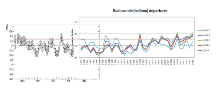
In their “hottest year ever” press briefing, NOAA included this graph, which stated that they have a 58 year long radiosonde temperature record. But they only showed the last 37 years in the graph. Ref.:
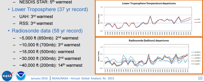
Here is why they are hiding the rest of the data. The earlier data showed as much pre-1979 cooling as the post-1979 warming.
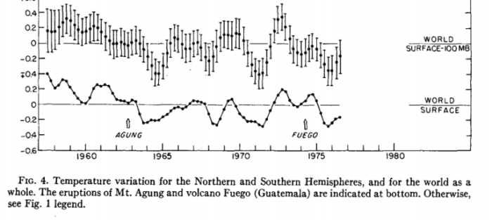
“.. combined the two graphs at the same scale below, and put a horizontal red reference line in, which shows that the earth’s atmosphere has not warmed at all since the late 1950’s”
Read original story here ..
Almost all our emission of CO2 has been emitted during that time, and it is increasing exponentially, through the roof .. And the temperature didn’t even blink. It’s like CO2 just don’t work – at all, on any scale or at any level.
And even if the graphs has been changed long time ago, 1936 is still the warmest year on record.
Truth doesn’t change even if the graphs get adjusted.
Fact is, temperature is amazingly stable – Do i need to mention that our CO2 emissions doesn’t look anything like this graph, where’s the correlation?
If you look closely you’ll see there’s actually a slight downward trend after 1950, overall flat.
