

Currently active in the comment section of The Daily Caller (example) under several FAKE profiles, most used is the profile with the nick: Scientia_Praecepta (anonymous, of course.)
From 2015
Tamino (Grant Foster) is Back at His Old Tricks…That Everyone (But His Followers) Can See Through
Or In a Discussion of the Hiatus Since 1998, Grant Foster Presents Trends from 1970 to 2010, Go Figure!
By Bob Tisdale
Statistician Grant Foster (a.k.a. blogger Tamino, who also likes to call himself Hansen’s Bulldog) is back to his one of his old debate tactics again: redirection. Or maybe a squirrel passed by and, like Dug the talking dog from Pixar’s Up, Hansen’s Bulldog simply lost track of the topic at hand.
For some reason, Grant Foster wants to keep drawing attention to the fact that the night marine air temperature data that NOAA used as a reference do not support the changes NOAA made to their sea surface temperature data…and I am more than happy to discuss this topic yet another time.
BACKSTORY – THE EXCHANGE
Grant Foster didn’t like my descriptions of the new NOAA ERSST.v4-based global surface temperature products in my post Both NOAA and GISS Have Switched to NOAA’s Overcooked “Pause-Busting” Sea Surface Temperature Data for Their Global Temperature Products. So he complained about them in his post New GISS data. His rant began:
Of course, deniers are frothing at the mouth about the change. The “hit man” for WUWT, Bob Tisdale has been insulting it as much as he can. He keeps saying things like “Overcooked “Pause-Busting” Sea Surface Temperature Data” and “unjustifiable, overcooked adjustments presented in Karl et al. (2015)” and “magically warmed data.”
And Grant Foster didn’t like that I presented the revised UAH lower troposphere data in a positive light.
I responded to Grant Foster’s complaints (a.k.a. Hansen’s Bulldog’s whines) with the post Fundamental Differences between the NOAA and UAH Global Temperature Updates. The bottom line of it was:
The changes to the UAH dataset can obviously be justified, while the changes to the NOAA data obviously cannot be.
I even reminded readers that the topic of discussion was the slowdown in global surface warming, or the hiatus.
Refering to another topic in Tamino’s post, I wonder if Tamino would prefer the term “hiatus busting” instead of “pause busting”, considering that Karl et al (2015) used the term hiatus, not pause, in the title of their paper Possible artifacts of data biases in the recent global surface warming hiatus. Mmm, probably not, because Tamino uses the same misdirectionas NOAA did in Karl et al.
THAT LEADS US TO THE TOPIC OF THIS POST
Obviously, Grant Foster missed that paragraph about the hiatus, the pause, the slowdown, whatever you want to call it…or Hansen’s Bulldog got sidetracked by a squirrel, because he replied with the post Fundamental Differences between Bob Tisdale and Reality.
Grant Foster started with my comparison graph of the new ERSST.v4 data and the HADNMAT2 data, which served as a reference for the ERSST.v4 data. See Figure 1.
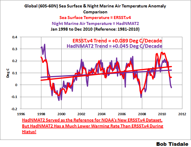
Figure 1
The data clearly show that NOAA cannot justify the excessive warming rate during the global warming slowdown because the warming rate of the NOAA data is far higher than the dataset they used as reference. Yet Grant Foster included that graph in his post.
Note: If you’re wondering why the data in the graph ends in 2010, that’s the last year of the HADNMAT2 data at the KNMI Climate Explorer. We’ll address the start year of 1998 in a moment. [End note.]
Foster did not dispute my trend presentation; he simply replicated my graph (without the trends) in the first of his three graphs, which I’ve included as the top cell of my Figure 2. Then Grant Foster switched topics (timeframes) and presented two graphs that began in 1970, which I’ve included as Cells B & C of Figure 2.

Figure 2
About his 2nd and 3rd graphs (Cells B & C), Grant Foster writes (my boldface):
That certainly destroys the impression from Bob’s cherry-picked graph. But wait — is the NMAT trend estimate “much lower” and the ERSSTv4 trend estimate “much higher”? Well, that from NMAT is 0.0116 deg.C/yr, from ERSSTv4 it’s 0.0117 deg.C/yr. [sarcasm] Big difference! [\sarcasm]
“Cherry-picked?” How silly can Grant Foster get?!!! The topic at hand is the hiatus as described by Karl et al., not the trends starting in 1970. Only Grant (and his followers) are interested in the trends from 1970 to 2010.
And what was one of the years that Karl et al. used for the start of the slowdown in global surface warming?
Grant Foster failed to tell his readers that Karl et al. used 1998 as the start year for many of their trend comparisons. I’ve circled them on Figure 1 from Karl et al., which is included as my Figure 3. For the oceans, Karl et al. compared their “new” ERSST.v4 data to their “old” ERSST.v3b data.
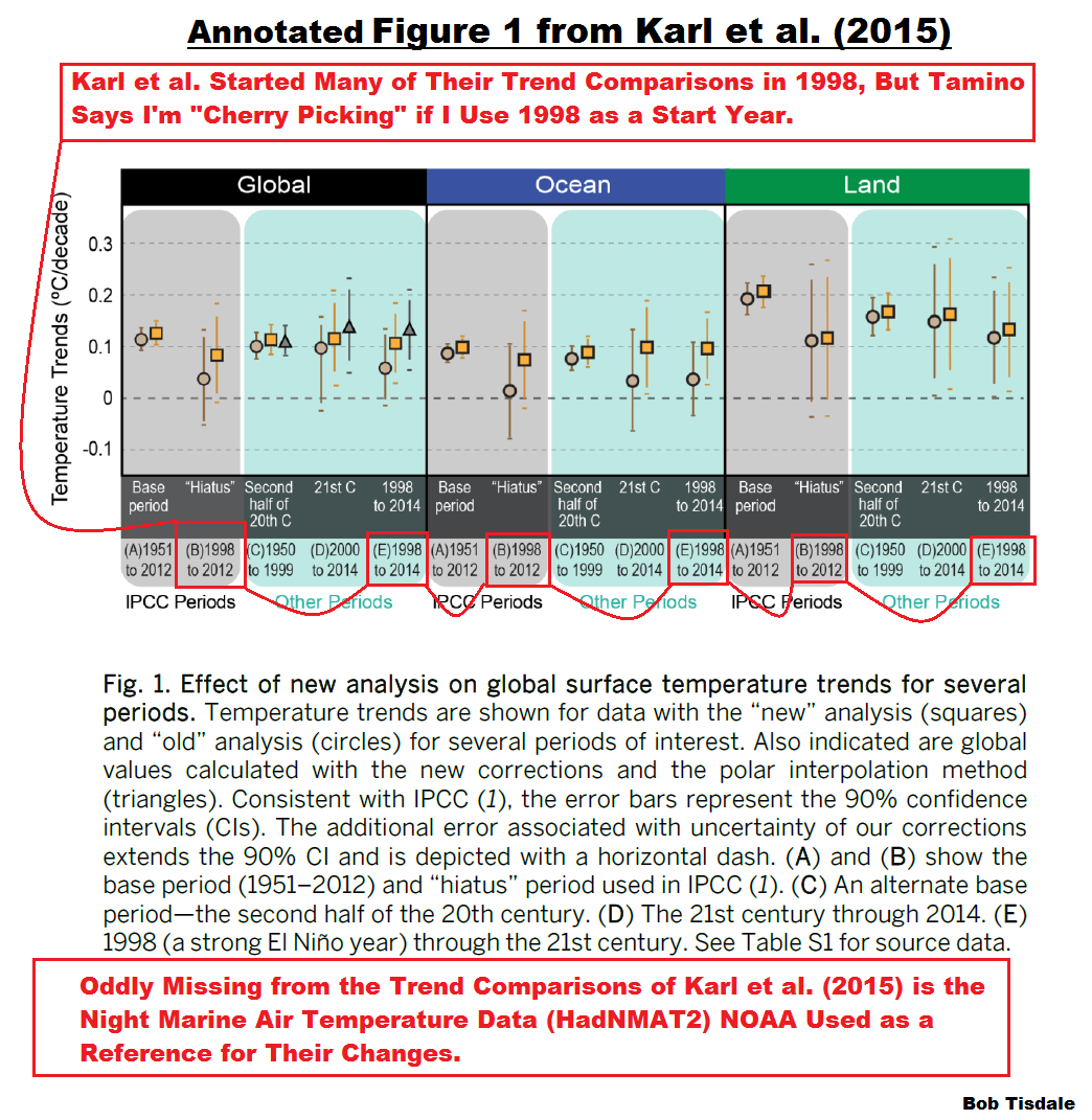
Figure 3
Also see the note at the bottom of Figure 3. One of the bases for the following two posts was the failure of Karl et al. to include trend comparisons of their new (overcooked) sea surface temperature dataset and the night marine air temperature dataset they used as a reference for their changes:
- More Curiosities about NOAA’s New “Pause Busting” Sea Surface Temperature Dataset, and,
- Open Letter to Tom Karl of NOAA/NCEI Regarding “Hiatus Busting” Paper
And I introduced Figure 1 in the latter of those two posts.
CLOSING
Hansen’s Bulldog (Grant Foster, a.k.a. Tamino) chooses to mislead his readers by ignoring the fact that Karl et al. used the start year of 1998 for many of their short-term trend comparisons, thereby making him look foolish when he claims that I’ve cherry-picked 1998 as the start year for my comparison. Anyone who read and understood Karl et al. (2015) can see the obvious failure in Tamino’s silly attempt at redirection.
Grant Foster did not dispute the trends listed on my Figure 1, which he included in his post.
Those trends showed, for the period of 1998 (a start year used by Karl et al. for trend comparisons) to 2010 (the end year of the HADNMAT2 data), that NOAA’s new ERSST.v4 sea surface temperature dataset had a much higher warming rate than the HADNMAT2 data, which NOAA used as reference for their adjustments.
In other words, NOAA overcooked the adjustments to their new ERSST.v4 data, which serve as the ocean component of the GISS and NCEI (formerly NCDC) global land+ocean surface temperature products.
Once again I have to thank Grant Foster (a.k.a. Tamino and Hansen’s Bulldog) for yet another opportunity to show that NOAA cannot justify the relatively high warming rate of their new ERSST.v4 sea surface temperature data during the hiatus, because it far exceeds the trend of the HadNMAT2 data that NOAA used as a reference.
[Side Note to Tom Karl/NOAA: Think of all of the web traffic that WattsUpWithThat gets. It dwarfs other global-warming blogs. You can blame Grant Foster for the last two posts about your overcooked ERSST.v4 data. Have a nice day.]
Ref.: https://wattsupwiththat.com/2015/07/21/tamino-grant-foster-is-back-at-his-old-tricksthat-everyone-but-his-followers-can-see-through/
………………….
Yet Even More Nonsense from Grant Foster (Tamino) et al. on the Bias Adjustments in the New NOAA Pause-Buster Sea Surface Temperature Dataset
UPDATE: It was pointed out in a comment that the model-data comparison in the post was skewed. I was comparing modeled marine air temperature minus modeled sea surface temperature anomalies to observed night marine air temperature minus sea surface temperature anomalies. Close, but not quite the same. I’ve crossed out that section and the references to it and removed the graphs. Sorry. It was a last-minute addition that was a mistake. (Memo to self: Stop making last minute additions.) Thanks, Phil.
The rest of the post is correct.
INTRODUCTION
The saga continues. For those new to this topic, see the backstory near the end of the post.
Grant Foster (a.k.a. Tamino and Hansen’s Bulldog) has written yet another post The Bob about my simple comparison of the new NOAA pause-buster sea surface temperature dataset and the UKMO HADNMAT2 marine air temperature dataset that was used for bias adjustments on that NOAA dataset. In it, he quotes a comment at his blog from Miriam O’Brien, a.k.a. Sou from HotWhopper. Miriam recycled a flawed argument that I addressed over a month ago.
In his post, after falsely claiming that I hadn’t looked for reasons for the difference between the night marine air temperature data and the updated NOAA sea surface temperature data during the hiatus, Grant Foster presented a model that was based on a multivariate regression analysis…in an attempt to explain that difference. Right off the get go, though, you can see that Hansen’s Bulldog lost focus again. He also failed to list the time lags and scaling factors for the individual variables so that his results can be verified. We’re also interested in those scaling factors to see if the relative weighting of the individual components are proportioned properly for a temperature-related global dataset. To overcome that lack of information from Grant Foster, I also used a multivariate regression analysis to determine the factors. I think you’ll find the results interesting.
Last, before presenting his long-term graph of the difference between the HADNMAT2 and ERSST.v4 datasets, Grant Foster forgot to check which ocean surface temperature dataset climate models say should be warming faster: the ocean surface or the marine air directly above it. That provides us with another way to show that NOAA overcooked their adjustments to their sea surface temperature data.
MORE DETAIL
Grant Foster began his recent post with a quote of a comment at his blog from Miriam O’Brien (Sou from Hot Whopper) of all people. That quote begins:
Bob has it all wrong in his now umpteenth post about this. HadNMAT2 is used to correct a bias in ship sea surface temps only. For the period he’s looking at (in fact since the early 1980s), they only comprise 10% of the observations. The rest of the data is from buoys, and HadNMAT doesn’t apply to them. They are much more accurate than ship data anyway. So much so that if ship and buoy data are together, the buoy data is given six times the weighting of ship data. So the comparison Bob thinks he’s making is completely and utterly wrong. And not just because the trends is actually quite close. He is not comparing what he thinks he is comparing.
Contrary to Miriam’s misinformation, I know exactly what I’m comparing. And as we’ll discuss in a few moments, I also know exactly why I’m comparing them. We discussed it a month ago, but alarmists are notorious for short memories.
The revisions to the NOAA sea surface temperature dataset are discussed in detail in the papers:
- Huang et al. (2015) Extended Reconstructed Sea Surface Temperature version 4 (ERSST.v4), Part I. Upgrades and Intercomparisons, and
- Liu et al. (2015) Extended Reconstructed Sea Surface Temperature version 4 (ERSST.v4): Part II. Parametric and Structural Uncertainty Estimations.
In the abstract of Part 1, Huang et al specifically state that there are two bias adjustments (both of which impact the pause):
The monthly Extended Reconstructed Sea Surface Temperature (ERSST) dataset, available on global 2° × 2° grids, has been revised herein to version 4 (v4) from v3b. Major revisions include updated and substantially more complete input data from the International Comprehensive Ocean–Atmosphere Data Set (ICOADS) release 2.5; revised empirical orthogonal teleconnections (EOTs) and EOT acceptance criterion; updated sea surface temperature (SST) quality control procedures; revised SST anomaly (SSTA) evaluation methods; updated bias adjustments of ship SSTs using the Hadley Centre Nighttime Marine Air Temperature dataset version 2 (HadNMAT2); and buoy SST bias adjustment not previously made in v3b.
So Miriam O’Brien is correct that the HADNMAT2 data are only used for ship bias adjustments. However, she incorrectly concludes that my reasons are wrong. Suspecting that someone would attempt the argument she’s using, I addressed that subject more than a month ago in my open letter to Tom Karl:

Figure 1
Someone might want to try to claim that the higher warming rate of the NOAA ERSST.v4 data is caused by the growing number of buoy-based versus ship-based observations. That logic of course is flawed (1) because the HadNMAT2 data are not impacted by the buoy-ship bias, which is why NOAA used the HadNMAT2 data as a reference in the first place, and (2) because the two datasets have exactly the same warming rate for much of the period shown in Figure 1. That is, the trends of the two datasets are the same from July 1998 to December 2007, a period when buoys were being deployed and becoming the dominant in situ source of sea surface temperature data. See Figure 2.

Figure 2
[End of copy from earlier post]
That text was included with my first presentation of the graph their they’re complaining about.
Grant Foster returned to Miriam O’Brien’s claim in one of his closing paragraphs:
Of course the salient point is what was pointed out by Sou, that the comparison Bob thinks he’s making is completely and utterly wrong.
As noted above, the comparison I’m making is not wrong. It’s being done for very specific reasons. Miriam O’Brien and Grant Foster might not like those reasons, but those reasons are sound.
ON TAMINO’S MODEL OF THE DIFFERENCE BETWEEN THE HADNMAT2 AND ERSST.v4 DATA
Grant Foster begins the discussion of his modeling efforts with (my boldface):

I’ve circled the earliest part, from 1998, where NMAT is higher than ERSSTv4. It’s one of the main reasons that The Bob found a lower trend for NMAT than for ERSSTv4 since 1998. The difference since 1998 shows an estimated trend of -0.0044 deg.C/yr, the same value The Bob found for the difference in their individual trend rates.
What The Bob didn’t bother to do is wonder, why might that be? Just because there are differences between NMAT and sea surface temperature, that doesn’t mean the people estimating SST have rigged the game; why, there might even be an actual, physical reason for it.
What’s so special about 1998? The Bob wants us to believe it’s because of that non-existent “hiatus”. But let’s not forget that 1998 was the year of the big el Niño. Which made me wonder, might that have affected the difference between NMAT and sea surface temperature? What about aerosols from volcanic eruptions? What about changes in solar radiation?
Contrary to Grant Foster’s claims, I not only wondered, I discussed that difference more than a month ago in my open letter to Tom Karl. In a continuation of my earlier discussion from that post:
In reality, the differences in the trends shown in Figure 1 are based on the responses to ENSO events. Notice in Figure 1 how the night marine air temperature (HadNMAT2) data have a greater response to the 1997/98 El Niño and as a result they drop more during the transition to the 1998-01 La Niña. We might expect that response from the HADNMAT2 data because they are not infilled, while the greater spatial coverage of the ERSST.v4 data would tend to suppress the data volatility in response to ENSO. We can see the additional volatility of the HadNMAT2 data throughout Figure 2. At the other end of the graph in Figure 1, note how the new NOAA ERSST.v4 sea surface temperature data have the greater response to the 2009/10 El Niño…or, even more likely, they have been adjusted upward unnecessarily. The additional response of the sea surface temperature data to the 2009/10 El Niño is odd, to say the least.
[End of copy from earlier post]
Back to Grant Foster’s discussion of his model. He continued:
To investigate, I took the difference between NMAT and ERSSTv4, and sought to discover how it might be related to el Niño, aerosols, and solar output. As I’ve done before, I used the multivariate el Niño index to quantify el Niño, aerosol optical depth for volcanic aerosols, and sunspot numbers as a proxy for solar output. I allowed for lagged response to each of those variables. I also allowed for an annual cycle, to account for possible annually cyclic differences between the two variables under consideration.
The available data extend from 1950 through 2010, but I started the regression in 1952 to ensure there was sufficient “prior” data for lagged variables. It turns out that all three variables affect the NMAT-ERSSTv4 difference. Here again is the difference, this time since 1952, compared to the resulting model:

It turns out that the model explains the NMAT-ERSSTv4 differences rather well, particularly the high value in 1998 as mostly due to the el Niño of that year.
Grant Foster didn’t supply the information necessary to support his claim that “It turns out that all three variables affect the NMAT-ERSSTv4 difference.” According to his model, they had an impact together, but he did not show the individual impacts of the three variables.
Contrary to Grant Foster’s claim, the extended Multivariate ENSO Index (MEI), the SIDC sunspot data and the GISS stratospheric aerosol optical depth data extend back in time to 1880. Then again, the farther back in time we go, the less reliable the data become. The 1950s were a reasonable time to start the regression analysis.
Looking back at Grant Foster’s first graph, he subtracted the ERSST.v4 sea surface temperature data from the reference HADNMAT night marine air temperature. However, it’s much easier to see the warm bias in NOAA’s pause-buster data, and the timing of when it kicks in, if we do the opposite, subtract the reference HADNMAT2 data from the ERSST.v4 data. See my Figure 3. That way we can see that the difference after 2007 had a greater impact on the warming rates than the difference before July 1998. Not surprisingly, Grant Foster was focused on the wrong end of the graph with his circle at 1998.

Figure 3
But for the rest of this discussion, we’ll return to the way Grant Foster has presented the difference. Keep in mind, though that a negative trend means NOAA’s sea surface temperature data are rising faster than the reference night marine air temperature data.
GRANT FOSTER LOST FOCUS AGAIN
While Grant Foster was right to use longer-term data (1952 to 2010) for his regression analysis, he only presented illustrations of the results for that period. But the topic of discussion is the period of 1998 to 2010, the slowdown in global warming. Looking at his model-data graph above, it’s difficult to see how well his model actually performs during the hiatus. He claims, though:
It turns out that the model explains the NMAT-ERSSTv4 differences rather well, particularly the high value in 1998 as mostly due to the el Niño of that year.
Rather well is relative. His model is based on a multiple regression analysis, which takes the data for the dependent variable (the HADNMAT2-ERSST.v4 difference) and determines the weighting of the independent variables (the ENSO index, the sunspot data and the volcanic aerosol data) that, in effect, provide the best fit for the dependent variable. (Grant Foster’s regression analysis also shifts the independent variables in time in that effort.) So we would expect the model to explain some of “the NMAT-ERSSTv4 differences rather well”. But we can also see that the model misses many other features of the data. Additionally, the regression analysis doesn’t care whether the relative weightings of the independent variables make sense on a physical basis. (More on that topic later.)
Grant Foster praised his model because it captured the 1997/98 El Niño. Of course the model makes an uptick in 1997/98. One of the components of the model is an ENSO index.
But what about the rest of the hiatus? Why didn’t he focus on that? He made a brief mention of it in his post, and we’ll present that in a moment.
His model also makes an uptick for the 2009/10 El Niño, but the data, unexpectedly, move in the opposite direction, indicating the NOAA sea surface temperature warmed more than the HadNMAT2 data, when according to his model, it should have warmed less…as noted earlier. (See my discussions of Figures 1 and 2 in this post again.)
GRANT FOSTER DIDN’T PRESENT THE SCALING FACTORS OR TIME LAGS FOR THE INDEPENDENT VARIABLES: THE SUNSPOTS, THE ENSO INDEX AND THE VOLCANIC AEROSOL DATA
As mentioned in the opening of this post, if Grant Foster had provided the scaling factors of the independent variables, we could check his results and see whether the relative weightings of the ENSO index, the sunspot data and the volcanic aerosol data make sense on a physical basis. Also of concern are the time lags determined by his regression analysis. Unfortunately, Grant Foster, as of the time of this writing, failed to provide any of that valuable information.
THE RESULTS OF ANOTHER MULTIPLE REGRESSION ANALYSIS
Because Grant didn’t supply that information, I used the Analyse-It software to perform a separate multiple regression analysis of the HADNMAT2-ERSST.v4 difference, using the same independent variables: NOAA’s Multivariate ENSO Index (MEI), the SIDC sunspot data, and the GISS aerosol optical depth data. The MEI and SIDC data are available at the KNMI Climate Explorer, specifically on the Monthly Climate Indices webpage, and the GISS aerosol optical thickness data are available here.
Unlike Grant Foster’s software, the Analyse-It software does not determine the best time lags for the independent variables. So I used the average of the time lags (4 months for the ENSO index, 1 month for the sunspot data, and 6 months for the volcanic aerosols) listed in Table 1 of Foster and Rahmstorf (2011), of which Grant Foster was lead author. If Grant Foster provides us with the scaling coefficients and time lags his model found, I’ll be happy to redo this.
Using EXCEL, I created a model for the period of 1952 to 2010, shown in Figure 4. The scaling factors and time lags are listed on it. Before determining their difference, I used the base years of 1952 to 2010 for the HADNMAT2 and ERSST.v4 anomalies, to assure that my choice of base years didn’t skew the results. You might get slightly different scaling coefficients using different base years, but the results should be similar.
Like Grant Foster’s model, we would expect the model to mimic parts of the data, because the regression analysis determined the weightings of the three variables (the ENSO index, the sunspot data and the volcanic aerosol data) that furnished the “best fit”. Example: Because my model, like his, uses the Multivariate ENSO index as one of its independent variables, it too creates an uptick at the 1997/98 El Niño, but it also shows the unexpected divergence between the model and data at the end in response to the 2009/10 El Niño. The monthly variations in the HADNMAT2-ERSST.v4 difference in my graph are not the same as Grant Foster’s, but that could be caused by the use of different base years for anomalies. Grant Foster’s model also appears to have greater year-to-year variations, but since he didn’t bother to provide the necessary information for us to duplicate his efforts, we’ll have to rely on my results.

Figure 4
But also like Grant Foster’s model, we can see that my model also misses many of the features of the data.
Keep in mind that everything shown before 1998 in Figure 4 has no real bearing on our discussion of the hiatus, which is the topic of this debate. I’ve presented Figure 4 to show that my results are similar to Grant Foster’s. Figure 5 includes only the results of the regression analysis we’re interested in…for the period of 1998 to 2010. The top graph presents the “raw” model and data, and in the bottom graph, the model and data have been smoothed with 12-month running-mean filters.

Figure 5
Based on the linear trend lines, it appears that a portion of the HADNMAT2-ERSST.v4 difference could be—repeat that, could be—caused by the impacts of ENSO, the solar cycle, and volcanic aerosols…assuming that the scaling coefficients of the ENSO index, the sunspot data and the volcanic aerosol data relative to one another are realistic.
And we can also see that the greater divergence between model and data occurs during the 2009/10 El Niño, not the decay of the 1997/98 El Niño. So, again, Grant Foster was looking at the wrong El Niño.
WHAT GRANT FOSTER HAS TO SAY ABOUT THE MODEL-DATA DIFFERENCE DURING THE HIATUS
Grant Foster went a step farther and subtracted the model output from the data to determine the residuals, once again using the longer-term results, not the results for the hiatus.

If we study only the residuals since 1998, by golly the estimated trend is still negative. But only by -0.0018 deg.C/yr (not -0.0044), a value which is not statistically significant. So much for The Bob’s “much lower.”
But, as noted above, Grant Foster failed to show something about his model: whether the scalings of the ENSO index, the sunspot data and the volcanic aerosol data are realistic. So we have to return to my results.
THE RELATIVE WEIGHTINGS OF THE INDEPENDENT VARIABLES
Before we present the results for the difference between the sea surface temperature and night marine air temperature data, let’s look at the results for a global surface temperature dataset so we can see what we should expect.
I used detrended monthly GISS Land-Ocean Temperature Index data (from 1952 to 2010) in the multiple regression analysis, along with the same three independent variables. The time lags were the same, with the exception of the Aerosol Optical Depth data, which are shown as 7 months for the GISS data in Table 1 of Foster and Rahmstorf (2011). Figure 6 presents the three independent variables multiplied by the scaling coefficients that were determined by the regression analysis.

Figure 6
As expected, the two greatest sources of year-to-year fluctuations in global surface temperatures are ENSO (El Niño and La Niña) events and stratospheric aerosols from catastrophic explosive volcanic eruptions. (Note: The regression analysis cannot determine the long-term aftereffects of ENSO…the Trenberth Jumps…they only indicate, based on statistical analysis, the direct linear effects of ENSO on global surface temperatures. For a further discussion on how linear regression analyses miss those long-term warming effects of ENSO, see the post here.) As expected, according to the regression analysis, the eruption of El Chichon in 1982 had a slightly greater impact on surface temperatures than the 1982/83 El Niño. And as expected, according to the regression analysis, the effects of the decadal variations in the solar cycle are an order of magnitude less than the impacts of ENSO and strong volcanic eruptions.
We’ve seen discussions of the relative strengths of the impacts of those variables for decades. Of all weather events, El Niño and La Niña events have the greatest impacts on annual variations in surface temperature. The only other naturally occurring factors that can be stronger than them are catastrophic explosive volcanos. On the other hand, the decadal variations in surface temperatures due to the solar cycle are comparatively tiny compared to ENSO and volcanos.
That’s what we should expect!
But that’s not what was delivered with the regression analysis of the HADMAT2-ERSST.v4 difference. See Figure 7. The relationship between our ENSO index and the volcanic aerosols appears relatively “normal”. BUT (and that’s a great big but) the decadal variations in the modeled impacts of solar cycles are an order of magnitude greater than we would expect. According to the regression analysis, for example, the maximum of Solar Cycle 19 (starts in the mid-1950s) is comparable in strength to the impacts of the El Niño events of 1982/83 and 1997/98.

Figure 7
Maybe that’s why Grant Foster didn’t supply the scaling coefficients or the time lags so we could investigate his model. If his results are similar to mine, the trend of his model during the hiatus depends on unrealistically strong solar cycle impacts.
Note: You may be thinking that there might actually be a physical explanation for the monstrously excessive response of the HADMAT2-ERSST.v4 difference to the solar cycle data. Keep in mind, though, that the response to volcanic aerosols is solar related…inasmuch as the volcanic aerosols limit the amount of solar radiation reaching the surface of the oceans. You can argue all you want about whatever it is you want to argue about, but unless you can support those claims with data-based analysis or studies, all you’re providing is conjecture. We get enough model-based conjecture from the climate science community—we don’t need any more.
THE RELATIVE WEIGHTINGS OF THE INDEPENDENT VARIABLES DURING THE HIATUS
Let’s return to the what-we-would-expect and what-we-got format but this time zoom in on the independent variables for the hiatus period of 1998 to 2010. That is, the data are the same as in Figures 6 and 7. We’ve just shortened the timeframe to the years of the hiatus.
We’ll again start with the detrended GISS land ocean surface temperature data. Figure 8 presents those scaled independent variables for the hiatus, 1998 to 2010. Looking at the linear trend lines, we would expect the impacts of ENSO to be greatest, followed by the sunspot data due to the change from solar maximum to minimum in that timeframe. The volcanic aerosols are basically flat and had no impact.

Figure 8
Again, that’s what we would expect from a global temperature-related metric.
But that’s not what we got from the regression analysis of the HADMAT2-ERSST.v4 difference. See Figure 9. During the hiatus, the regression analysis suggests that the change from solar maximum to minimum had the greatest impact on the trend, noticeably larger than the trend of the linear impacts of ENSO.

Figure 9
If Grant Foster’s model has the same physically unrealistic weighting of its solar component, then his residuals during the hiatus are skewed. All things considered, it appears as though the only way to create the trend Grant Foster found is with a model that grossly exaggerates the impacts of the solar cycle.
MORE MISINFORMATION FROM MIRIAM O’BRIEN (SOU AT HOTWHOPPER)
On the thread of Grant Foster’s post The Bob, which as a reminder was the subject of this post, Miriam O’Brien graces us once again with irrelevant information. See her July 22, 2015 at 12:52pm comment here. It reads (my boldface):
Thanks, Tamino.
I removed some charts from the HW article before posting it, because it was getting a bit too long. However if anyone’s interested, the charts I took out were from a 2013 paper by Elizabeth Kent et al. Figure 15 had some charts that plotted the difference between sea and air temps (HadSST and HadNMAT2 and some other comparisons).
http://onlinelibrary.wiley.com/doi/10.1002/jgrd.50152/pdf
There’s no reason to expect night time air temperature would follow the same trend as the sea surface temperature exactly, though it’s fairly close. I also came across articles which discussed the diurnal variation – some places can have different trends in daytime vs night temps in sea surface temps. That is, other than the obvious where ships exhibit a maritime heat island effect during the day (which is why the night time marine air temps are used, not the day time ones).
More misdirection from Miriam. The topic of discussion is NOAA’s ERSST.v4 data, not the UKMO’s HadSST3 dataset, which differs greatly from NOAA’s ERSST.v4 data.
In fact, for the period of 1998 to 2010, the same basic disparity in warming rates (as HADNMAT2 Versus ERSST.v4) exists between the UKMO HADSST3 and NOAA’s ERSST.v4 data. See Figure 10. Now recall that the UKMO’s HadSST3 sea surface temperature data are also adjusted for ship-buoy bias. In other words, the UKMO’s sea surface temperature and night marine air temperature datasets basically show the same warming rate from 1998 to 2010, and those warming rates are both well below the warming rate of the overcooked NOAA ERSST.v4 data.

Figure 10
And while the HadNMAT2 data ends in 2010, the HadSST3 data are updated to present times, May 2015. So we can see that the excessive warming rate of the ERSST.v4 data continues during the hiatus.

My thanks to Miriam O’Brien for reminding me to illustrate that disparity between the two sea surface temperature datasets that have both been adjusted for ship-buoy bias.
Someone is bound to ask, who made the UKMO data the bellwether? NOAA did. NOAA used the HADNMAT2 data for bias adjustments since the 1800s. See Huang et al. (2015) Extended Reconstructed Sea Surface Temperature version 4 (ERSST.v4), Part I. Upgrades and Intercomparisons
Consider this: NOAA could easily have increased the warming rate of their reconstructed sea surface temperature data to the warming rate exhibited by the UKMO’s sea surface and marine air temperature datasets for the period of 1998 to 2012. Skeptics would have complained but NOAA would then have had two other datasets to point to. But NOAA didn’t. NOAA chose to overcook their adjustments…in an attempt to reduce the impacts of the slowdown in global sea surface warming this century.
(Side note to Miriam O’Brien: I was much entertained by the ad hom-filled opening two paragraphs of your recent post Biased Bob Tisdale is all at sea. And the rest of your post was laughable. Thank you for showing that you, like Grant Foster, can’t remain on topic, which, since you obviously can’t recall, is the hiatus. As a reminder, here’s the title of the Karl et al. (2015) paper that started this all Possible artifacts of data biases in the recent global surface warming HIATUS. <– Get it?)
ABOUT THE STATISTICAL SIGNIFICANCE, OR LACK THEREOF, OF THE HADNMAT2-ERSST.V4 DIFFERENCE
This post, like the earlier posts about this topic, is sure to generate discussions about the statistical significance in the difference between NOAA’s ERSST.v4 data and the UKMO HADNMAT2 data…that the difference is not statistically significant.
Those discussions help to highlight one of the problems with the surface temperature datasets. Every 6 months, year, two years, the suppliers of surface temperature data make minor (statistically insignificant) changes to the data. Each time, the supplier can claim the change isn’t statistically significant. But over a number of years, NOAA has done its best to eliminate the slowdown in global warming by making a series of compounding statistically insignificant changes. If the foundation of the hypothesis of human-induced global warming was not so fragile, NOAA would not have to constantly tweak the data to show more warming…and more warming…and more warming.
Regardless of whether or not the difference between NOAA’s ERSST.v4 data and the UKMO HADNMAT2 data is statistically significant, it is an easy-to-show example of one of the compounding never-ending NOAA data tweaks, so I’ll continue to show it.
ANOTHER EXAMPLE OF NOAA OVERCOOKING THEIR NEW SEA SURFACE TEMPERATURE DATASET
Grant Foster insisted on looking at data that extended back in time before the hiatus in this post and past posts. The slight negative trend in the HADNMAT2-ERSST.v4 difference since 1952, Figure 12, indicates the new ERSST.v4 sea surface temperature data have a slightly higher warming rate than the reference HADNMAT2 night marine air temperature data over that time period. In other words, according to NOAA, global sea surfaces warm faster than the marine air directly above the ocean surfaces.
(Graph removed)
Figure 12
And that reminded me of the climate models used by the IPCC. It’s always good to remember what climate models say, in theory, should be taking place, because they indicate the opposite should be happening. According to the groupthink (the consensus) of the climate modeling groups around the globe, known as the multi-model mean, the marine air should be warming faster than the ocean surface. See Figure 13.
(Graph removed.)
Figure 13
How could NOAA have overlooked a basic fundamental like that? Or is NOAA suggesting the ocean-warming physics are wrong in climate models?
In addition to overcooking the sea surface temperature data during the hiatus, it appears that NOAA has overcooked the warming rate of their sea surface temperature data since 1952 as well by a noticeable amount.
You may want to argue that the difference in trends (0.022 Deg C/Decade) is small. My responses: (1) It shows yet another unjustifiable tweak by NOAA, and (2) the HADNMAT2-ERSST.v4 difference contradicts physics.
And just in case you’re wondering, I also performed multiple regression analyses on the modeled marine air temperature-sea surface temperature anomaly difference, using the CMIP5 multi-model mean and a couple of individual models from that archive. The solar cycle components were smaller than the ENSO and volcanic aerosol factors, as they should be. But even more curious, they all showed a solar cycle component that was the opposite sign of the one based on the HADNMAT2-ERSST.v4 difference, meaning the solar cycle in the models decreased, not increased, the temperature difference between the marine air and sea surface temperatures during the hiatus. I’ll present those results in a future post.
Thanks, Grant. As soon as I saw your HADNMAT2-ERSST.v4 difference graph, I knew there was another problem with the ERSST.v4 adjustments.
BACKSTORY – THE EXCHANGE
- Grant Foster didn’t like my descriptions of the new NOAA ERSST.v4-based global surface temperature products in my post Both NOAA and GISS Have Switched to NOAA’s Overcooked “Pause-Busting” Sea Surface Temperature Data for Their Global Temperature Products. So he complained about them in his post New GISS data (archived here). And Grant Foster didn’t like that I presented the revised UAH lower troposphere data in a positive light.
- I responded to Grant Foster’s complaints with the post Fundamental Differences between the NOAA and UAH Global Temperature Updates.
- Obviously, Grant Foster missed the fact the focus of the discussion is the hiatus, because he replied with the post Fundamental Differences between Bob Tisdale and Reality (archived here), which also presented data leading up to the hiatus.
- I reminded Grant the topic of discussion was the hiatus in my response Tamino (Grant Foster) is Back at His Old Tricks…That Everyone (But His Followers) Can See Through.
- Grant Foster responded to that with The Bob, which is the subject of this post.
CLOSING
Over a month ago, we had discussed one of Miriam O’Brien’s arguments, which Grant Foster quoted and found noteworthy, and we determined the logic behind it to be flawed.
If the relative weightings of the independent variables in Grant Foster’s model are as physically skewed as those found with the multiple regression analysis I performed, then his modeled trend during the hiatus is meaningless. And looking back at Figure 9, the only way to accomplish the trend found by Grant Foster is to grossly exaggerate the impacts of the solar cycle in the model.
One of Grant Foster’s closing paragraphs reads:
I expect The Bob will post about this again. I expect he’ll repeat himself again. After all, the trend in NMAT is lower than that in ERSSTv4 since 1998, which can’t possibly have anything to do with el Niño or atmospheric aerosols or solar variations because that’s the time of the non-existent “hiatus”.
As discussed in this post, I had already considered and illustrated how El Niño events had skewed the HADNMAT2-ERSST.v4 difference. So yes, I repeated myself, but those repetitions contradicted his claims and his quote from Miriam O’Brien. But then Grant Foster introduced another topic…his model. And as I showed in my Figure 5, Grant Foster was focused on the wrong El Niño. We showed in Figure 9 that the stratospheric aerosols were a non-factor in the HADNMAT2-ERSST.v4 difference. That leaves the solar variations. If the weighting of Grant Foster’s sunspot data is as skewed as I found with my regression analysis, we can dismiss his model.
Also, because of the reminder from Miriam O’Brien (Sou at HotWhopper), I’ve shown that a disparity in trends similar to the HADNMAT2-ERSST.v4 difference also exists between the UKMO HADSST3 data and the NOAA ERSST.v4, both of which are ship-buoy-bias-adjusted sea surface temperature datasets, for the period of 1998 to 2010, Figure 10.
Last, the climate models used by the IPCC indicate, globally, marine air should be warming faster than sea surfaces since the early 1950s, which is the opposite of the relationship between the new overcooked NOAA sea surface temperature data and the night marine air temperature data NOAA used for bias adjustments.
Next in this series will be a more detailed look at the long-term data. The working title is, Did NOAA Destroy a Perfectly Good Sea Surface Temperature Reconstruction with the Latest Upgrade?
Ref.: https://wattsupwiththat.com/2015/07/25/yet-even-more-nonsense-from-grant-foster-tamino-et-al-on-the-bias-adjustments-in-the-new-noaa-pause-buster-sea-surface-temperature-dataset/
…………………
From 2013
Tamino Resorts to Childish Attempts at Humor But Offers Nothing of Value
INITIAL NOTE: This post includes a link to and title of a recent post by Tamino, in which he attempted sophomoric humor in an effort to amuse his audience. While I realize responding to it at the same base level would be fun for many, please do not lower yourselves to his depths on this thread.
INTRODUCTION
My post No Matter How the CMIP5 (IPCC AR5) Models Are Presented They Still Look Bad was a discussion of the IPCC’s model-data comparison of global temperature anomalies in their Figure 1-4 from their 5th Assessment Report. (Also see the cross post at WattsUpWithThat.) I added an update to it that read:
As quoted above, Dana Nuccitelli noted (my boldface):
At the time, 1990 was an especially hot year. Consequently, if the models and data were properly baselined, the 1990 data point would be located toward the high end of the range of model simulations.
“Especially hot?” Utter nonsense.
Dana appears to be parroting Tamino from Tamino’s blog post here.
The reality: 1990 was an ENSO-neutral year, according to NOAA’s Oceanic NINO Index. Therefore, “1990 was…” NOT “…an especially hot year”. It was simply warmer than previous years because surface temperatures were warming then. I’m not sure why that’s so hard a concept for warmists to grasp. The only reason it might appear warm is that the 1991-94 data were noticeably impacted by the eruption of Mount Pinatubo.
Tamino was simply playing games with data as Tamino likes to do, and Dana Nuccitelli bought it hook, line and sinker.
Or Dana Nuccitelli hasn’t yet learned that repeating bogus statements doesn’t make them any less bogus.
That was not well received by Tamino.
BACKSTORY
This all began last December. The original Figure 1-4 (my Figure 1) from the IPCC’s draft of AR5 was presented in the WattsUpWithThat post Dr. David Whitehouse on the AR5 figure 1.4.

Figure 1
You’ll note that the data for 2011 is outside the ranges of all of the model generations, especially those from the 4th Assessment Report (AR4).
Tamino was not impressed with David Whitehouse’s post or with the IPCC’s original model-data comparison in their Figure 1-4. He expressed his displeasures in the post Fake skeptic draws fake picture of Global Temperature. Toward the end of that rebuttal post, Tamino suggested that the IPCC should shift the data up 0.1 deg C and then he presents his renditions of the IPCC’s model-data comparison (See My Figure 2):
When I offset the observations by 0.1 deg.C, we get more realistic comparison of observations to projections:
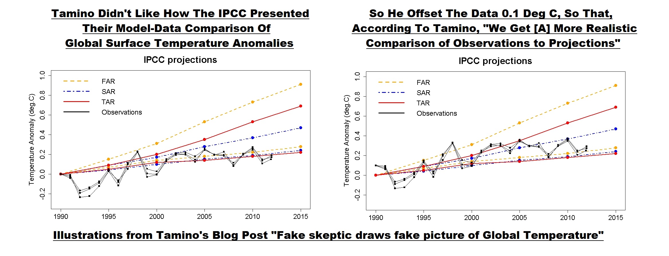
Figure 2
Some of you will note that the 4th generation (AR4) models are not included in Tamino’s model-data comparisons.
The topic was resurrected when the IPCC released the approved drafts of their 5thAssessment Report. In it, the IPCC changed their model-data comparison of global temperatures in Figure 1-4. (See my Figure 3.) Steve McIntyre reported on the change in his post IPCC: Fixing the Facts. Tamino’s post was referenced on that ClimateAudit thread numerous times.

Figure 3
Dana Nuccitelli presented his take in the SkepticalScience post IPCC model global warming projections have done much better than you think. Judith Curry discussed the switch in Figure 1-4 in her post Spinning the climate model – observation comparison: Part II. The switch in the IPCC’s Figure 1-4 was one of the topics in my post Questions the Media Should Be Asking the IPCC – The Hiatus in Warming, which was cross posted at JoNova. Dana Nuccitelli once again added to the discussion with Why Curry, McIntyre, and Co. are Still Wrong about IPCC Climate Model Accuracy at SkepticalScience.
Then Lucia commented on Tamino’s shift in the data in her post at TheBlackboard Tamino’s take on SOD AR5 Figure 1.4! See my Figure 4.

Figure 4
Lucia writes:
(Shifted projections in heavy black, observations dark red circles.)
I’m tempted to just let the figure speak for itself. But I think it’s better to always include text that describes what we see in the figure.
What we see is that if we followed Tamino’s suggests and the models had been absolutely perfect we would conclude the models tended to underestimate the observed temperature anomalies by roughly -.08 C and so were running “cool”. But in fact, our assessment would be deluded. The appearance of “running cool” arose entirely from using different baselines for “models” and “observations”: for the ‘projections’ we used the average over 1990 itself, for the second we used 1980-1990 itself. The shift arises because 1990 was “warm” in the models (and ‘projections’) compared to the average over the full 20 year period.
The same day, I published No Matter How the CMIP5 (IPCC AR5) Models Are Presented They Still Look Bad and Tamino took exception to my statement:
“1990 was…” NOT “…an especially hot year”.
There have been a number of additional posts on the subject of the IPCC’s Figure 1-4, including Steve McIntyre’s Fixing the Facts 2, but we’ll end the sequence there.
A CURIOSITY
My Figure 5 is Figure 1 from Rahmstorf et al. (2012) “Comparing climate projections to observations up to 2011”. Tamino (Grant Foster) was one of the authors.

Figure 5
And for those having trouble seeing the very light pink “unadjusted” data, see my Figure 6. I’ve highlighted the unadjusted data in black.

Figure 6
Could the IPCC have based their original Figure 1-4 on Figure 1 from Rahmstorf et al (2012)?
NOTE: We’ve discussed in numerous posts how the effects of El Niño and La Nina events cannot be removed from instrument temperature record using the methods of Rahmstorf et al. (2012). For an example, see the post Rahmstorf et al (2012) Insist on Prolonging a Myth about El Niño and La Niña. Also see the cross post at WattsUpWithThat.
Enough backstory.
TAMINO BELIEVES 1990 WAS ESPECIALLY HOT
As noted in the Introduction, Tamino didn’t like the update to my post No Matter How the CMIP5 (IPCC AR5) Models Are Presented They Still Look Bad.
Tamino’s response was his post Bob Tisdale pisses on leg, claims it’s raining, the title and text of which is are sophomoric at best.
In it, Tamino presented annual long-term GISS Land-Ocean Temperature Index (LOTI) data compared to an unspecified smoothed version (here). He subtracted the smoothed data from the raw data and presented the residuals (here). And in response to my note about the impacts of Mount Pinatubo in 1991, Tamino presented the annual GISS LOTI from 1975 to 1990 along with a linear trend line (here).
After my first scan his post, it occurred to me that Tamino elected not to use the adjusted data from Foster and Rahmstorf (2011) “Global temperature evolution 1979–2010”, but more on that later.
Tamino presented data as Tamino wanted to present data. That’s fine. But there are other ways to present data. Apparently, Tamino assumed that I made a statement that I could not back.
Rahmstorf et al. (2012), of which Tamino was co-author, recommended averaging the five global temperature datasets (GISS LOTI, HADCRUT, NCDC, RSS TLT, and UAH TLT):
…in order to avoid any discussion of what is ‘the best’ data set.
So we’ll use that as a reference in the following example. If we average the five global temperature datasets for the period of 1979 to 2012 and simply detrend them using a what Tamino calls a “simple linear trend”, Figure 7, we can see that the residual temperatures for 8 years exceeded the 1990 value and that two others were comparable. Based on my presentation of data, I will continue to say that 1990 was NOT especially hot.

Figure 7
NOTE: I enjoyed the comments on the thread of Tamino’s post. One of them even reminded me of the happy grammar school games of morphing people’s names: see the one by blogger Nick on October 5, 2013 at 8:39 pm. But typical of those who comment at Tamino’s, Nick missed something that was obvious, and it was obvious back then even to six-year-olds. He could have been even more clever and replaced “dale” with “pail”. That would have been much funnier, Nick…to a six-year-old. Then again, maybe Nick is a six-year-old.
WHY WOULD TAMINO AVOID USING HIS ENSO-, VOLCANO- AND SOLAR-ADJUSTED DATASET?
The answer should be obvious. The adjusted data did not provide the answer Tamino wanted to show.
I mentioned both ENSO and volcanoes in the update to my post No Matter How the CMIP5 (IPCC AR5) Models Are Presented They Still Look Bad, stating that “1990 was an ENSO-neutral year…” and “…that the 1991-94 data were noticeably impacted by the eruption of Mount Pinatubo”.
It would have been logical for Tamino to present his global temperature data that had been adjusted for ENSO, volcanic aerosols and solar variations from his paper Foster and Rahmstorf (2011). In fact, blogger WebHubTelescope’s October 7, 2013 at 3:55 amcomment should have prompted Tamino to do so:
Since B-Tis leans on ENSO so much, why not correct the GISS using the SOI and throw it back in his face?
My Figure 8 is Figure 8 from Foster and Rahmstorf (2011). It’s easy to replicate using any number of methods. See my Figure 9. I simply used the x-y coordinate feature of MS Paint.

Figure 8

Figure 9
The 1990 value in Figure 9 does NOT look especially hot compared the linear trend. Let’s detrend the replicated adjusted data from Foster and Rahmstorf’s Figure 8 to see if that’s correct. See Figure 10.

Figure 10
The residual values for nine years were warmer than the not-hot-at-all 1990.
Note to WebHubTelescope: That’s why Tamino ignored you.
So what can we conclude from this exercise? Tamino presents data as Tamino wants to present it, using methods that can differ depending on his needs at any given time. But there are multiple ways to present data. Tamino came to one conclusion based on how he elected to present the data, while I came to a totally different conclusion based on how I presented them.
MORE MISDIRECTION FROM TAMINO…AND, IN TURN, SKEPTICALSCIENCE
Tamino presented a graph at the end of his two posts I’ve linked herein. (See the model-data trend comparison here.) It illustrates the observed trends versus the trends projected from the models used in the IPCC’s 1st, 2nd and 3rd Assessment Reports. Dana Nuccitelli must have believed that illustration was important, because he included it his post Why Curry, McIntyre, and Co. are Still Wrong about IPCC Climate Model Accuracy. Or just as likely, Dana Nuccitelli was using it as smoke and mirrors.
The 1st, 2nd and 3rd generation climate models used by the IPCC for their earlier assessment reports are obsolete…many times over. No one should care one iota about the outputs of the 1st, 2nd and 3rd generation models. The most important climate models are the most recent generation, those in the CMIP5 archive, which were prepared for the IPCC’s recently released 5th Assessment Report. Of second-tier importance are the CMIP3-archived models used for the IPCC’s 4th Assessment Report.
And what do we understand about the models used in the IPCC’s 4th and 5th Assessment Reports?
Von Storch, et al. (2013) addressed them in “Can Climate Models Explain the Recent Stagnation in Global Warming?” (my boldface):
However, for the 15-year trend interval corresponding to the latest observation period 1998-2012, only 2% of the 62 CMIP5 and less than 1% of the 189 CMIP3 trend computations are as low as or lower than the observed trend. Applying the standard 5% statistical critical value, we conclude that the model projections are inconsistent with the recent observed global warming over the period 1998- 2012.
Focusing on the CMIP5 models, there’s Fyfe et al. (2013) Overestimated global warming over the past 20 years. See Judith Curry’s post here. Fyfe et al. (2013) write:
The evidence, therefore, indicates that the current generation of climate models (when run as a group, with the CMIP5 prescribed forcings) do not reproduce the observed global warming over the past 20 years, or the slowdown in global warming over the past fifteen years.
THE CURRENT GENERATION OF CLIMATE MODELS USED BY THE IPCC BELONG IN THE TRASH BIN
I was going to ignore Tamino’s recent post, and I managed to do so for about 3 weeks. But I figured, in addition to confirming why I believed the data showed 1990 was not unusually hot, I could also use my reply to once again illustrate examples of the flaws in the current climate models used by the IPCC.
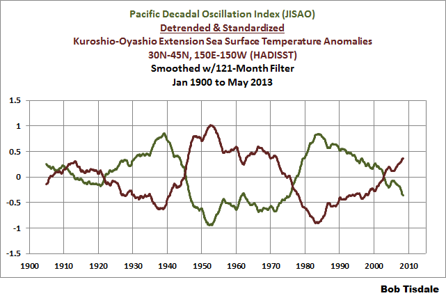
In the post Questions the Media Should Be Asking the IPCC – The Hiatus in Warming, I illustrated how the model mean of the climate models used by the IPCC did not simulate the Atlantic Multidecadal Oscillation (AMO). In that post, I used the method for presenting the AMO recommended by Trenberth and Shea (2006), which was to subtract global sea surface temperature anomalies (60S-60N) from sea surface temperature anomalies of the North Atlantic (0-60N, 80W-0). That model failing suggested that the observed Atlantic Multidecadal Oscillation was not a forced component of the models. See the left-hand cell of Figure 11. Similarly, we illustrated that the dominant source of multidecadal variations in the sea surface temperatures of the North Pacific (the sea surface temperatures of the Kuroshio-Oyashio Extension) were also not forced by manmade greenhouse gases, and that the models could not simulate those either. See the right-hand cell of Figure 11. (The sea surface temperature anomalies of the Kuroshio-Oyashio Extension are inversely related to the Pacific Decadal Oscillation. See the graph here.)
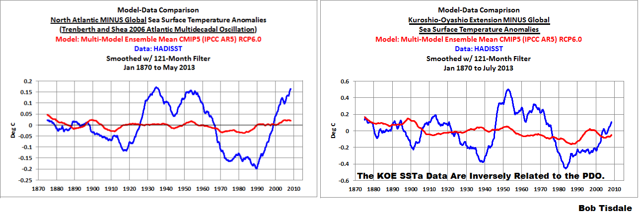
Figure 11
And in the post Open Letter to the Honorable John Kerry U.S. Secretary of State, we illustrated how the climate modelers had to double the rate of warming of global sea surface temperatures (left-hand cell of Figure 12) over the past 31+ years in order to get the modeled warming rate for land surface air temperatures (right-hand cell of Figure 12) close to the observations.

Figure 12
In the post IPCC Still Delusional about Carbon Dioxide, we illustrated and discussed how the climate models used by the IPCC do not support the hypothesis of human-induced global warming, and that many would say the models contradict it.
FURTHER READING
Over the past year, I’ve presented numerous failings exhibited by the latest generation of climate models. Those failings were collected in my book Climate Models Fail.
And as I’ve discussed in a multitude of blog posts here and at WattsUpWithThat for approaching 5 years, ocean heat content data and satellite-era sea surface temperature data both indicate the oceans warmed via naturally occurring, sunlight fueled, coupled ocean-atmosphere processes, primarily those associated with El Niño and La Niña events. See my illustrated essay “The Manmade Global Warming Challenge” (42mb) and, for much more information, see my book Who Turned on the Heat? Sales of my ebooks allow me to continue my research into human-induced and natural climate change and to continue to blog here at Climate Observations and at WattsUpWithThat.
CLOSING
Whenever someone, anyone, publishes a blog post that opposes Tamino’s beliefs in human-induced catastrophic global warming, he gets all excited and writes blog posts. Often times, Tamino attempts to belittle those with whom he disagrees. So far, Tamino has failed in his efforts to counter my blog posts that he objects to. In addition to what was discussed in this post, here are a few other examples:
Tamino expressed a complete lack of understanding of the Atlantic Multidecadal Oscillation in his post AMO. My reply to it is Comments On Tamino’s AMO Post.
Tamino objected a number of times to how I presented my model-data comparisons of ARGO-era ocean heat content data. See the example here from the post Is Ocean Heat Content Data All It’s Stacked Up to Be? As further discussed in that post:
See Tamino’s posts here and here, and my replies here and here. My replies were also cross posted at WattsUpWithThat here and here. Tamino didn’t like the point where I showed the model projections intersecting with the Ocean Heat Content data. Then RealClimate corrected their past model-data comparison posts. Refer to the RealClimate post OHC Model/Obs Comparison Errata. As a result, Gavin Schmidt then corrected the ocean heat content model-data comparison graphs in his earlier December 2009, May 2010, January 2011 and February 2012 posts. Refer also to my discussion of the RealClimate corrections here. Now the comparison in [Figure 1 from that post] , which has been updated through December 2012, appears overly generous to the models—that I should be shifting the model projection a little to the left.
And as a reminder, while it would be fun, please refrain from sophomoric humor on the thread. Most of the responses to Tamino are way too obvious anyway.
Ref.: https://wattsupwiththat.com/2013/10/26/tamino-resorts-to-childish-attempts-at-humor-but-offers-nothing-of-value/
…………………….
From 2012
Tamino Once Again Misleads His Followers
My blog post October to December 2011 NODC Ocean Heat Content Anomalies (0-700Meters) Update and Comments was cross posted by at WattsUpWithThat here. (As always, thanks, Anthony.) Starting at the January 27, 2012 at 8:44 am comment by J Bowers, I was informed of a critique of my ARGO-era model-data comparison graph by the Tamino titled Fake Predictions for Fake Skeptics. Oddly, Tamino does not provide a link to my post or the cross post at WattsUpWithThat, nor does Tamino’s post refer to me by name. But I believe it would be safe to say that Tamino was once again commenting on my graph that compares ARGO-era NODC Ocean Heat Content data to the climate model projection from Hansen et al (2005), “Earth’s energy imbalance: Confirmation and implications”. If he wasn’t, then Tamino fooled three persons who provided the initial comments about Tamino’s post on the WUWT thread and the few more who referred to Tamino’s post afterwards. The ARGO-era graph in question is shown again here as Figure 1. Thanks for the opportunity to post it once again up front in this post, Tamino.

Figure 1
Take a few seconds to read Tamino’s post, it’s not very long, and look at the graphs he presented in it.
My graph in Figure 1 is clearly labeled “ARGO-Era Global Ocean Heat Content Model-Data Comparison”. The title block lists the two datasets as NODC/Levitus et al (2009) and Hansen et al (2005) Model Mean Trend. It states that the Model Mean Trend and Observations had been Zeroed At Jan 2003. Last, the title block lists the time period of the monthly data as January 2003 to December 2011.
In other words, my graph in Figure 1 pertains to the ARGO-based OHC data and the GISS model projection starting in 2003. It does not represent the OHC data or the GISS model hindcast for the periods of 1993-2011 or 1955-2011, which are the periods Tamino chose to discuss.
Do any of the graphs in Tamino’s post list the same information in their title blocks? No.Do any of Tamino’s graphs compare the climate model projection from Hansen et al (2005) to the NODC OHC observations? No. Does Tamino refer to Hansen et al (2005) in his post? No. Do any of Tamino’s graphs present the NODC OHC data or the Hansen et al model projection during the ARGO-era, starting in January 2003 and ending in December 2011? No.
In other words, Tamino redirected the discussion from the ARGO-era period of 2003-2011 to other periods starting in 1955 and 1993. ARGO floats were not in use in 1955 and they were still not in use in 1993. He also redirected the discussion from the projection of the GISS model mean to the linear trend of the data itself. Yet Tamino’s followers fail to grasp the obvious differences between his post and my ARGO-era graph.
In my post, I explained quite clearly why I presented the ARGO-era model-data comparison with the data zeroed at 2003. Refer to the discussion under the heading of STANDARD DISCUSSION ABOUT ARGO-ERA MODEL-DATA COMPARISON. Basically, Hansen et al (2005) apparently zeroed their model mean and the NODC OHC data in 1993 to show how well their model matched the OHC data from 1993 to 2003. Hansen et al explained why they excluded the almost 40 years of OHC and hindcast data. The primary reason was their model could not reproduce the hump in the older version of the Levitus et al OHC data. Refer to Figure 2, which is a graph from a 2008 presentation by Gavin Schmidt of GISS. (See page 8 of GISS ModelE: MAP Objectives and Results.) I presented that same graph graph by Gavin in my post GISS OHC Model Trends: One Question Answered, Another Uncovered, which was linked in my OHC update from a few days ago.
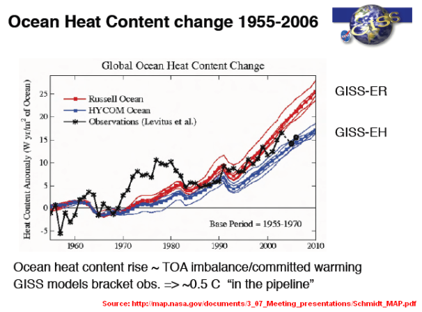
Figure 2
I zeroed the data for my graph in 2003, which is the end year of the Hansen et al (2005) graph, to show how poorly the model projection matched the data during the ARGO-era, from 2003 to present. In other words, to show that the ARGO-era OHC data was diverging from the model projection. Hansen et al (2005), as the authors of their paper, chose the year they apparently zeroed the data for one reason; I, as the author of my post, chose another year for another reason. I’m not sure why that’s so hard for Tamino to understand.
And then there’s Tamino’s post, which does not present the same comparison. He did, however, present data the way he wanted to present it. It’s pretty simple when you think about it. We all presented data the way we wanted to present it.
Some of the readers might wonder why Tamino failed to provide a similar ARGO-era comparison in his post. Could it be because he was steering clear of the fact that it doesn’t make any difference where the model projection intersects with the data when the trends are compared for the ARGO-era period of 2003 to 2011? See Figure 3. The trend of the model projection is still 3.5 times higher than the ARGO-era OHC trend. Note that I provided a similar graph to Figure 3 in my first response to his complaints about that ARGO-era OHC model-data comparison. See Figure 8 in my May 13, 2011 post On Tamino’s Post “Favorite Denier Tricks Or How To Hide The Incline”.
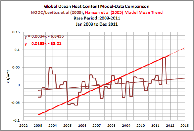
Figure 3
Figure 3 shows the ARGO-era OHC data diverging from the model projection. But the visual effect of that divergence is not a clear as it is in Figure 1. I presented the data in Figure 1 so that it provided the clearest picture of what I wanted to show, the divergence. That really should be obvious to anyone who looks at Figure 1.
Some might think Figure 1 is misleading. The reality is, those illustrating data present it so that it provides the best visual expression of the statement they are trying to make. The climate model-based paper Hansen et al (2005) deleted almost 40 years of data and appear to have zeroed their data at 1993 so that they could present their models in the best possible light. Base years are also chosen for other visual effects. The IPCC’s Figure 9.5 from AR4 (presented here as Figure 4) is a prime example. Refer to the IPCC’s discussion of it here.

Figure 4
The Hadley Centre presents their anomalies with the base years of 1961-1990. Why did the IPCC use 1901-1950? The answer is obvious. The earlier years were cooler and using 1901-1950 instead of 1961-1990 shifts the HADCRUT3 data up more than 0.2 deg C. In other words, the early base years make the HADCRUT anomaly data APPEAR warmer. It also brings the first HADCRUT3 data point close to a zero deg C anomaly, and that provides another visual effect: the normalcy of the early data.
Base years for anomalies are the choice of the person or organization presenting the data. Climate modelers choose to present their models in the best light; I do not.
Those familiar with the history of Tamino’s complaints about my posts understand they are simply attempts by him to mislead or misdirect his readers. And sometimes he makes blatantly obvious errors like using the wrong sea surface temperature dataset in a comparison with GISS LOTI data. His post Fake Predictions for Fake Skepticsis just another failed critique to add to the list.
ABOUT: Bob Tisdale – Climate Observations
SOURCE
The NODC OHC data used in this post is available through the KNMI Climate Explorer:
http://climexp.knmi.nl/selectfield_obs.cgi?someone@somewhere
Ref.: https://wattsupwiththat.com/2012/01/28/tamino-once-again-misleads-his-followers/
………………..
So now we know why the burger flippin’, “green” activists hate WUWT after years of being schooled by the very competent and honest scientists active on that website.
But the point of this post was just to show how dishonest activists can be, and Grant Foster aka Scientia_Praecepta aka Tamino is.
???

